

Zoya Developments
THREE ADDRESSES.THREE ATTITUDES.
- CLIENT
- ZOYA DEVELOPMENTS
- PROJECT
- Residential Real Estate
- Project Branding
- Visual Identity
- Brand Guidelines
- Fact Sheets
- 3D Floor Plans
- Key Visuals
- Cinematic Teasers
- Main Project Films
- Microsites
- Launch Assets
BRAND PHILOSOPHY
The Brief was Range
In real estate, it is easy for a developer portfolio to blur.
Same promises. Same lighting. Same words. Same polished-but-forgettable mood. Zoya needed the opposite.
Each project had to feel like it belonged to the same developer, but not the same template. Miorah had to glow. Izel had to feel made by hand. Élanora had to say less and still stay with you.
So we built three separate identities with one shared standard: make the project clear, memorable and easy to carry into market.

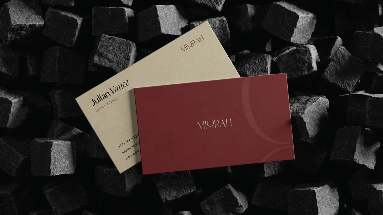
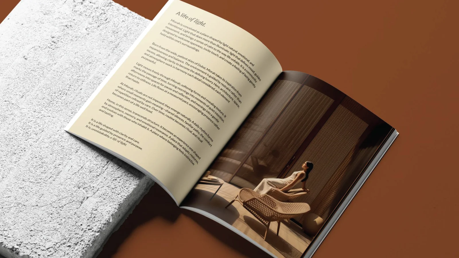
MIORAH BY ZOYA
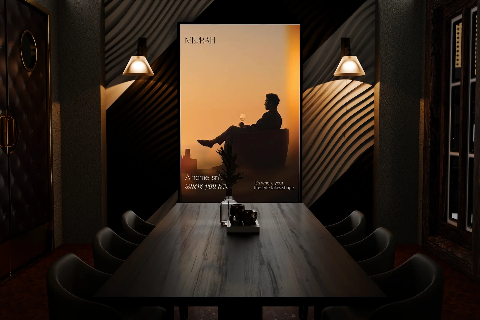
A Life of Light
Soft. Warm. Sunlit without trying too hard. Miorah was the kind of project that needed to feel calm before it said anything. So light became the starting point. Not as decoration. As behaviour.
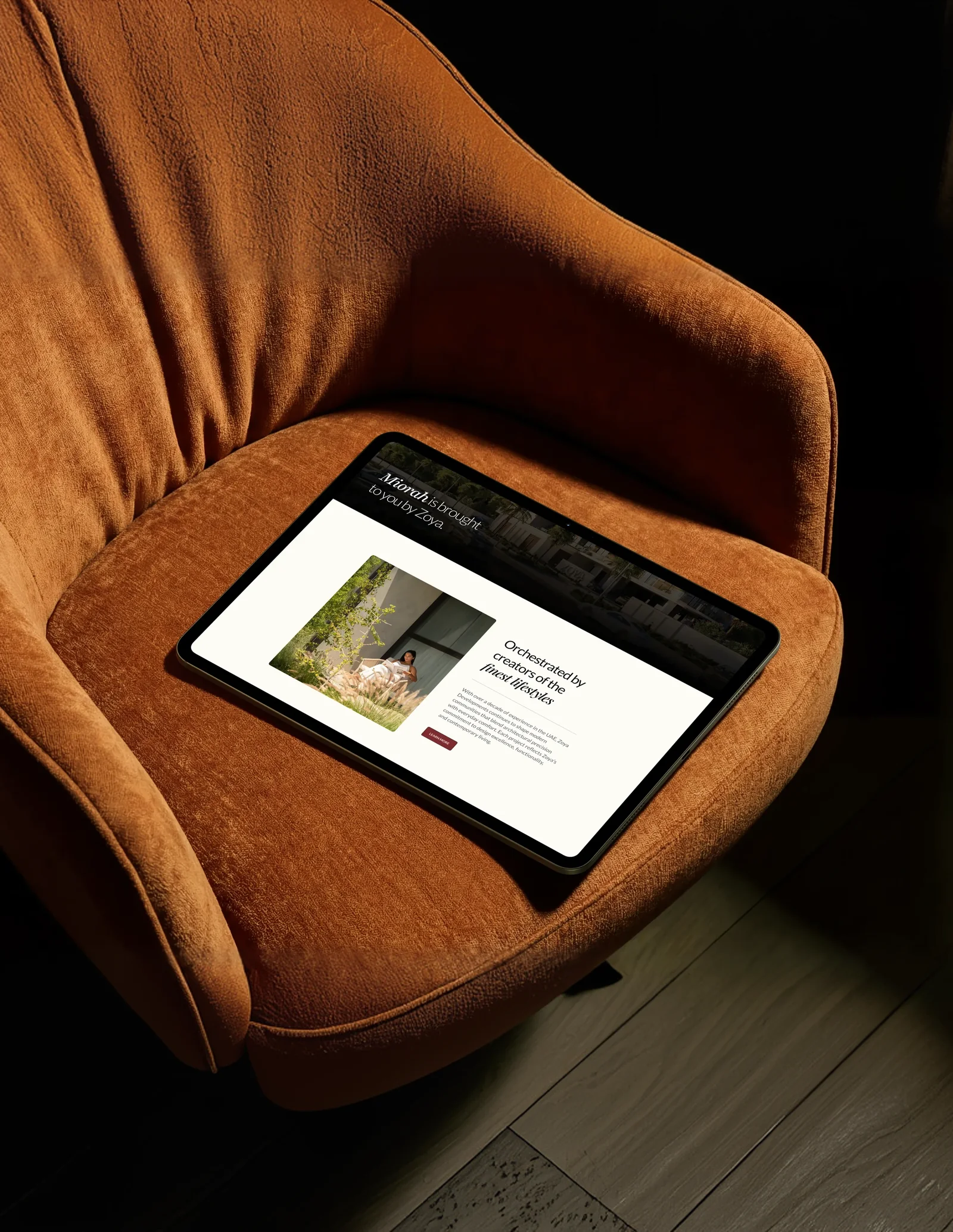
The identity stayed soft. The brochure opened gently. The visuals leaned warm. The films moved slowly enough to breathe. The microsite kept everything clean and easy.
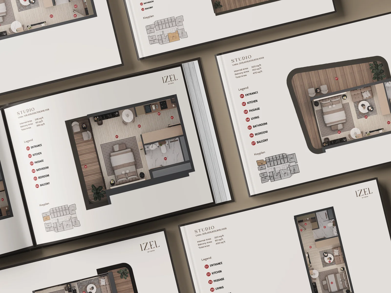
Across the brand guidelines, brochure, fact sheet, 3D floor plans, key visuals, teasers, main film and microsite, the work was built around one simple feeling: A home that lets the day in.
IZEL BY ZOYA
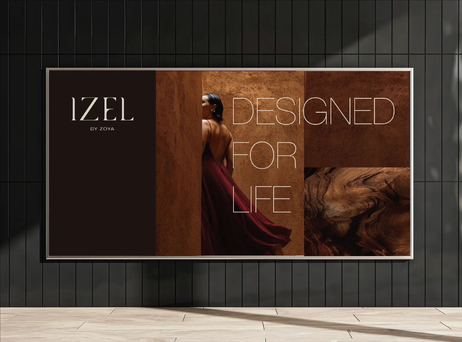
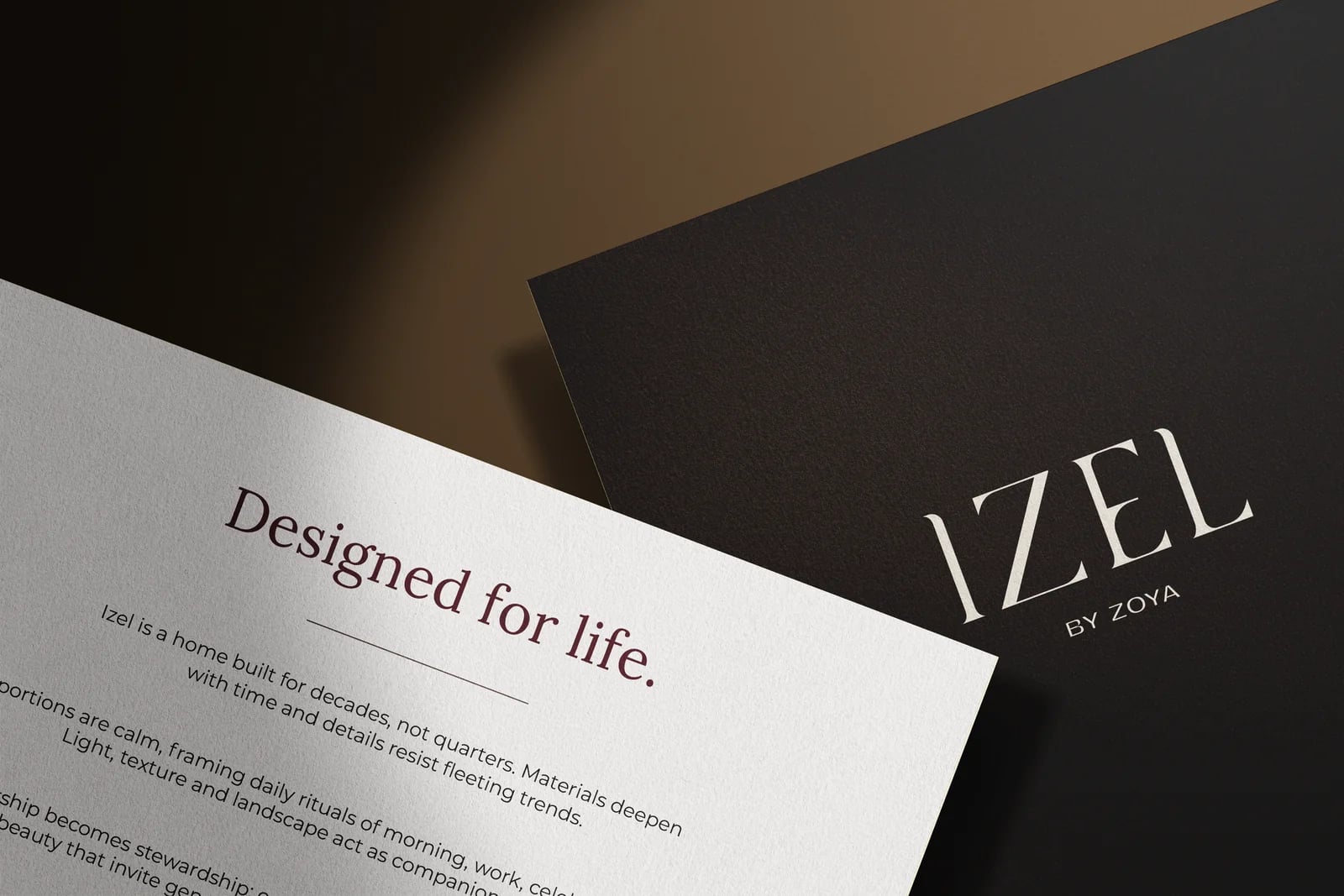
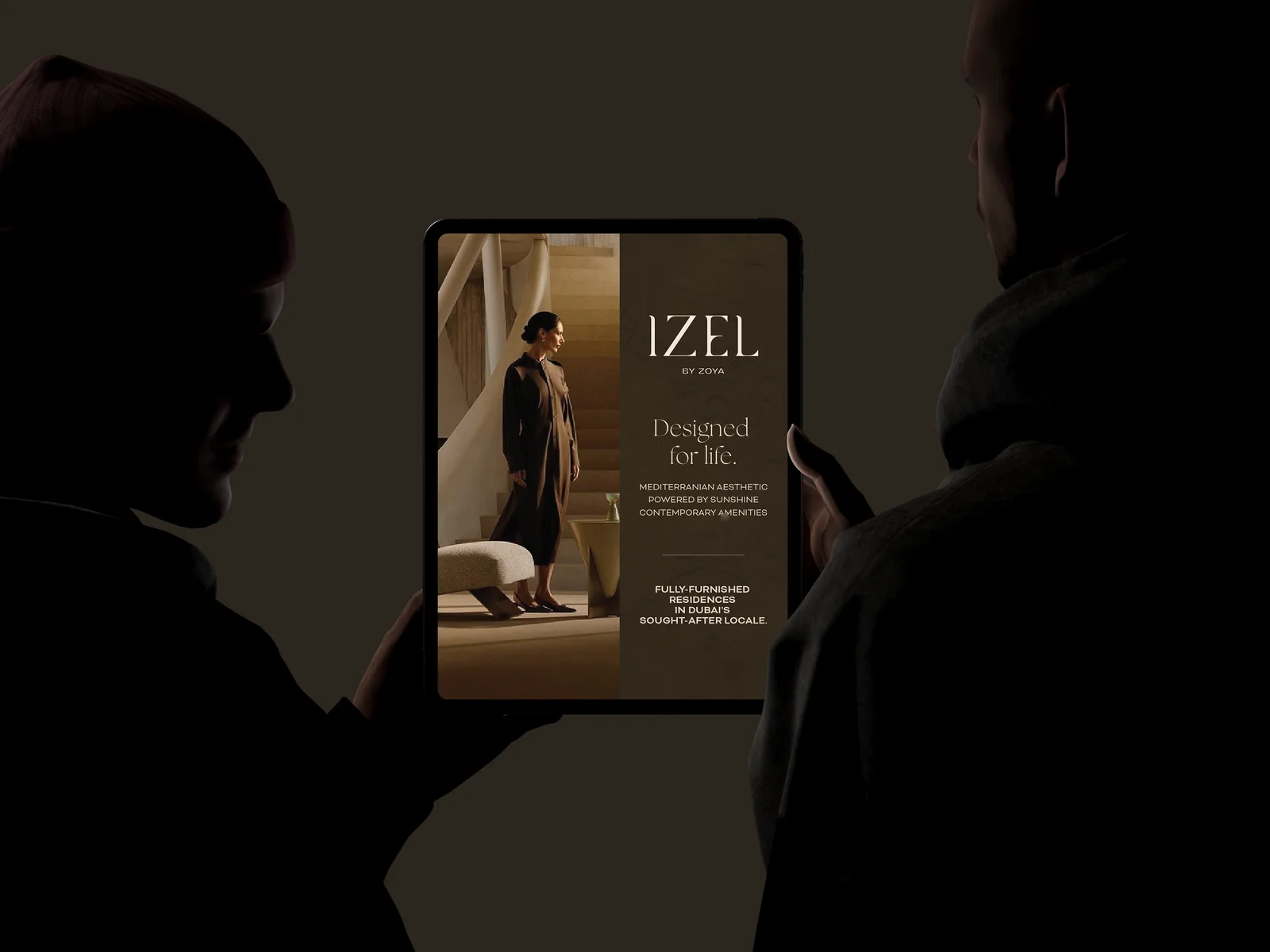
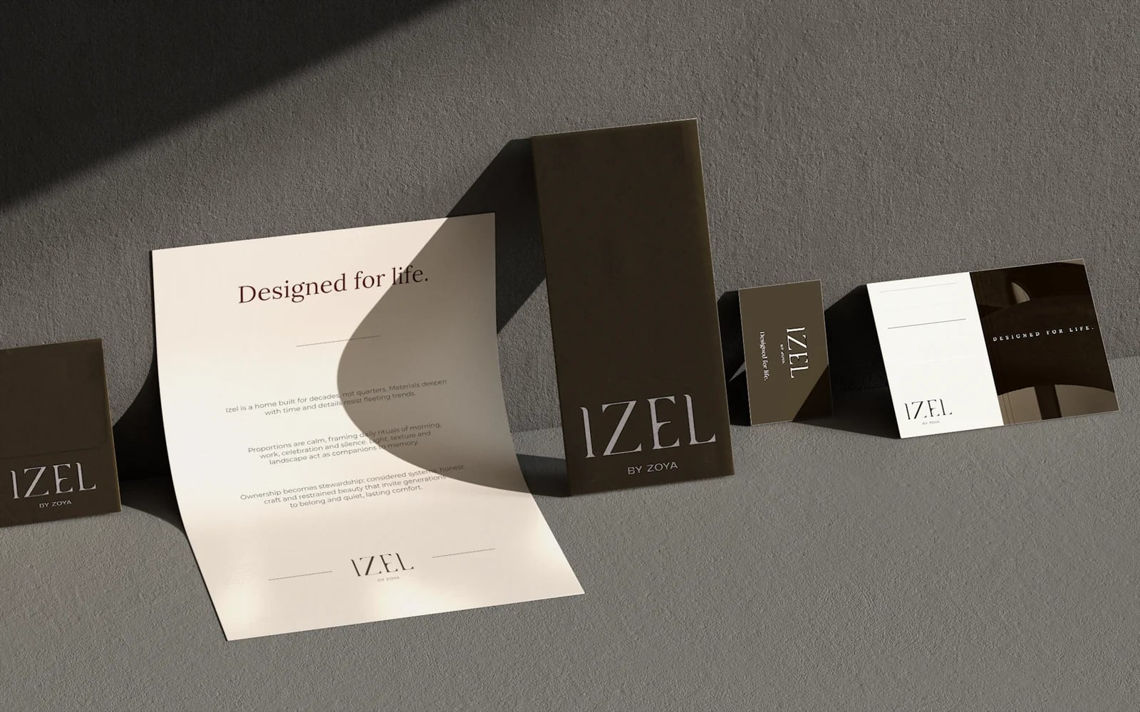
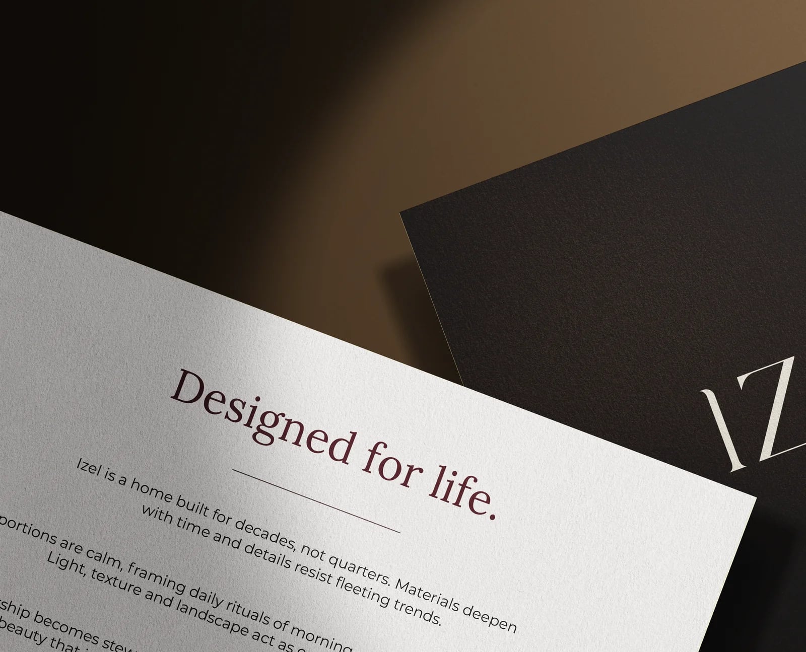
Designed for Life
Warm, crafted and made to feel lived in. You could feel it in the direction before the assets even came together.
Spanish-inspired cues. Warm materials. Design that felt more lived-in than staged. So the work had to feel crafted, not polished into sameness. The identity was composed. The brochure had warmth. The visuals carried tactility. The films gave it atmosphere. The microsite kept the story sharp.
Designed For Life became the filter. Not just a line on the cover, but the reason every asset had to feel useful, beautiful and built for the long run.
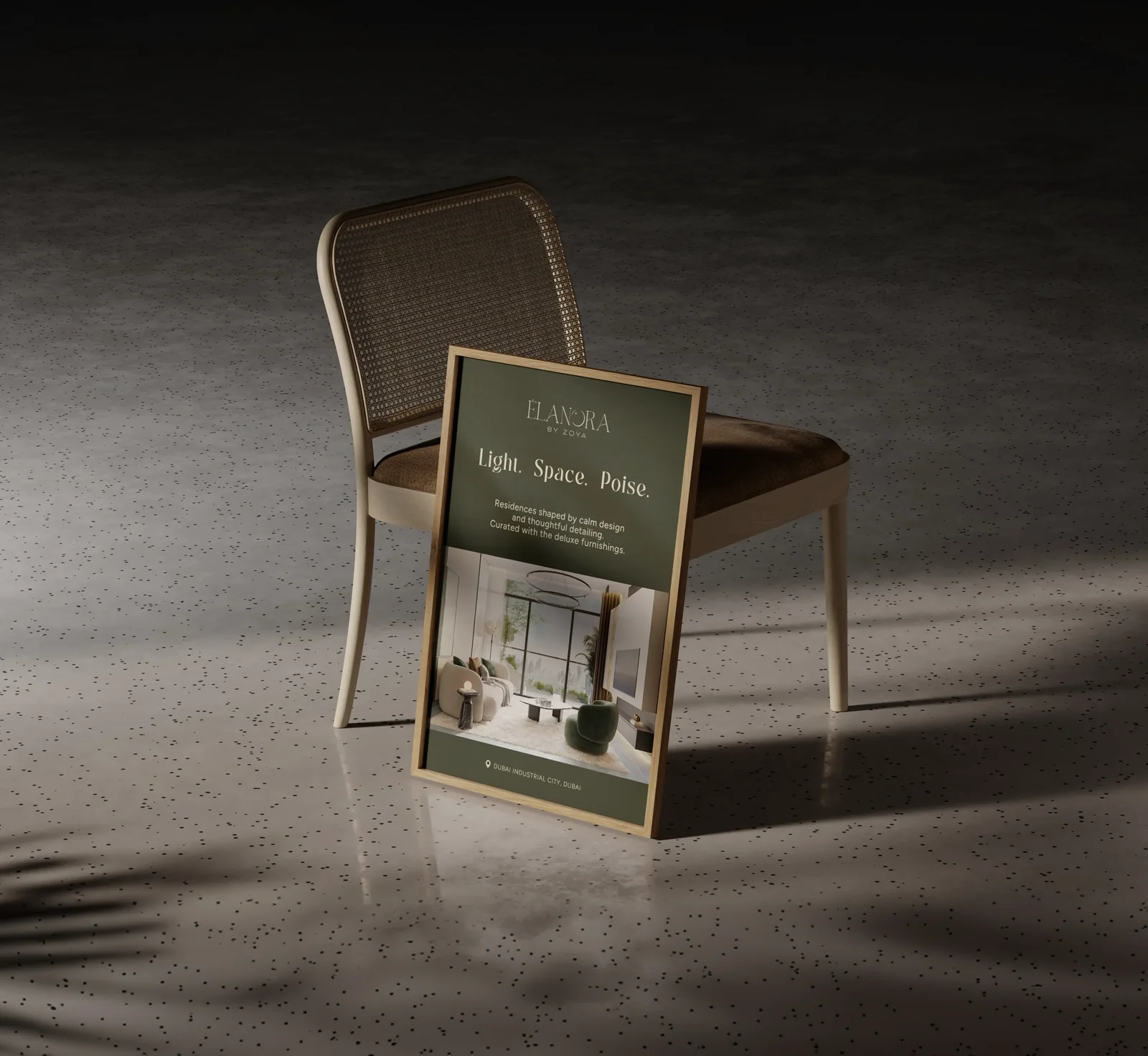
ÉLANORA BY ZOYA
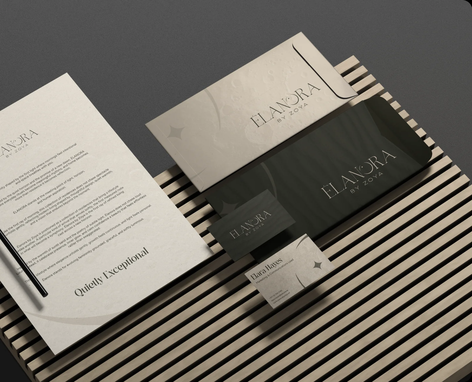
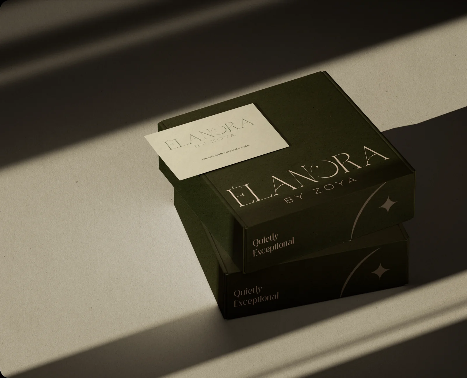
Quietly Exceptional
Calm, composed and allergic to overstatement.
Élanora had no interest in being loud. That was the point. Its world was built around first light, stillness, space and poise. The kind of project that does not beg for attention, but somehow keeps it. So we kept the work measured.
The identity held back. The visuals had air. The brochure felt elegant without getting precious. The films leaned into mood, not drama. The microsite kept the experience clean and considered.
Everything was built to feel quiet, but never forgettable. Because restraint only works when it has confidence behind it.
GALLERY
For Zoya Developments, we shaped three project worlds with their own identity, story, mood and launch toolkit. Each one built to feel distinct before the first serious sales conversation even began.
NEXT PROJECT